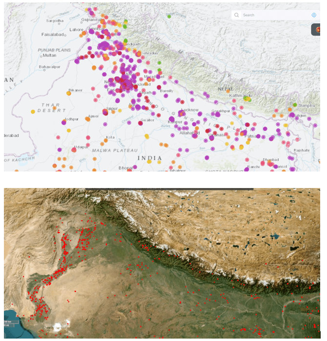
When you compare a NASA Fire Map with an AQI map of India, the connection seems obvious:
fires cause air pollution.
But the reality is more complex.
Fire hotspots are mostly in rural and forest areas, while the worst AQI is concentrated in urban regions like Delhi, Kanpur, Patna, and Lucknow — places with very few local fires.
This means fires worsen pollution, but they don’t create it.
High AQI is mainly driven by:
- Vehicular emissions
- Coal-based industries and power plants
- Construction dust
- Waste burning
- Loss of green cover
Fires act as seasonal amplifiers, pushing already polluted air into the “severe” zone.
Fire is the trigger. The system is the problem.
What actually works:
- Stop open burning
- Clean energy and electric mobility
- Better public transport
- Dust control at construction sites
- Decentralized waste management
- Large-scale urban forests and green belts
Fire maps show where land is burning.
AQI maps show where people are suffering.
Solutions decide whether our cities breathe — or choke.
Note : Links for
NASA Fire incidents : https://firms.modaps.eosdis.nasa.gov/map/#d:today;l:fires_all,earth;@79.9,29.4,6.1z
AQI live data : https://www.aqi.in/in/air-quality-map?map_type=aqi&loc_slug=india
